Thursday 22 January 2015

Poster Mock Ups


I need to edit the end of the gun because the orange end shows that it is a fake lookalike gun and my audience would pick up on this and question why someone would be using a obvious non genuine gun in a hitman crime thriller. This will have to be changed in each of my print products otherwise it doesn't portray the right image as I want the main character to be portrayed as mysterious and violent. I have chosen this reflection effect because in my narrative he is a normal school boy however he also has a secret side of being an undercover hitman. This effect shows that he has two sides and could be represented as two personalities (e.g. schizophrenic) which intrigues the audience and allows them to interpret it in their own way. 


Tuesday 13 January 2015

Movie Magazine Research


Movie magazines have conventions that are similar to a music magazine which I researched and constructed at AS. It is important that there is a large, bold masthead which is placed at the top in the centre so that it contributes to the visual syntax as the audience is drawn to this first. There is a house style which are selected colours that the cover will use and would be carried on through the magazine so that it's identifiable and recognisable to an audience as well as fonts, this will make it look more professional. Additional information such as a barcode and date will usually be found together, they must be clear enough to read but not too large so that it draws attention away from the coverlines. A main large image will be used on the cover so that the audience feels drawn into the actor/actresses emotions and feels connected with the character they are portraying. This image will usually be a MS or CU so their facial expressions, body language,  costume, make-up, hair style and props can be seen clearly for representation purposes so that the audience gets an idea of the type of film which is being reviewed or advertised. Sometimes smaller images are used to show other issues of the magazine which may appeal to the audience or other new films which are most likely blockbusters. Pugs/starbursts are shapes that may be used to make specific, important information stand out such as a special issue or an actors/actresses name who is particularly famous which may attract more readers/purchasers as they are fond of them. Coverlines are important to provide more information, for example 'Starring...' or 'Oscars Special!' this gives an insight into what else will be included inside the magazine which should interest the potential audience. There may be a tagline underneath the main headline which should be short and catchy  which either describes the film or sums it up in a sentence. Buzz words will catch the audiences attention, such as 'Exclusive' as they will be intrigued due to the fact it's an important issue that will contain big news about upcoming films or reviews. A banner may be placed along the bottom or top which may have a 'Plus' list of what else is to be expected inside or it may feature competitions

Sunday 11 January 2015

Audience Feedback

I have created a short questionnaire to hand out to my target audience so that I can get their preference on which film title logo idea is their favourite as their opinions are important as I am aiming this hitman crime thriller film 'Infraction' to men and women from the age of 15 up to around 55 years old. Therefore I will ask approximately 10 males and 10 females to get a fair result by asking both genders which logos appeal to them the most, 20 people in total. I will ask a range of ages between 15-55 as different age groups will have different opinions and preferences so it's important to try and attract a wide target audience as I expect 'Infraction' to be a mainstream film rather than having a niche market. 


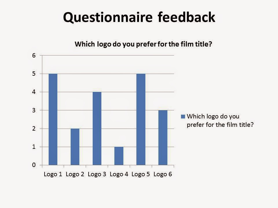
This bar chart shows that logo 1 and 5 were the most popular with my potential audience as they got 5 votes each. Comments I received were that the logos were simple but bold and clear, therefore they will be more visible when it's been placed on either a poster, billboard or magazine cover. Logo 3 was also quite well liked as it got 4 votes, the audience seemed to like the small gun image above the lettering however they were not as fond of the font used. 

This bar chart shows that the audience much preferred the film company production logo 1 and 2 as they got 8 votes each where as logo 3 only got 4 votes. Many people liked the movie reel image in logo 2 as they felt it was more associated with the film industry however some said they prefer the font in logo 1. 

Infraction Storyboard